- 1785 J. Ferrer y Ferrer 910, San Juan PR 00921
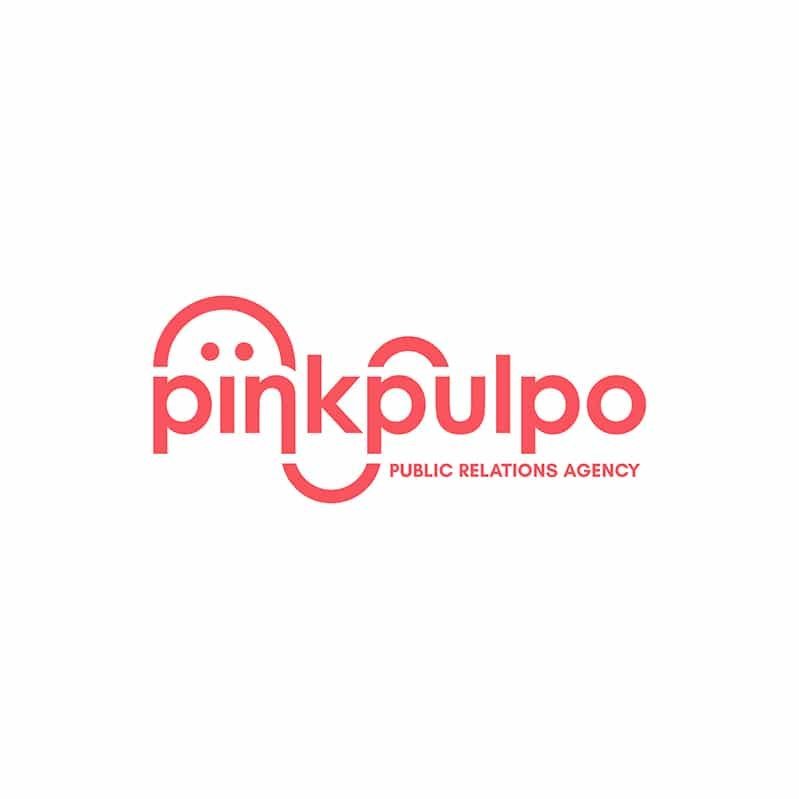
When the CEO of Pink Pulpo approached us, she was very clear about the company’s name and concept BUT couldn’t visualize a good logo for the company. Previous “failed” attempts made her fear that the combination of the word and the logo couldn’t represent how serious the business was. After a couple of meetings, she said something that struck us deep: “We are an octopus, we are a public relations agency, but we are also able to do many other things for our clients.” The rest is history, we were so sure of this design that it was the only design we made, and she loved it at first sight, just like us.
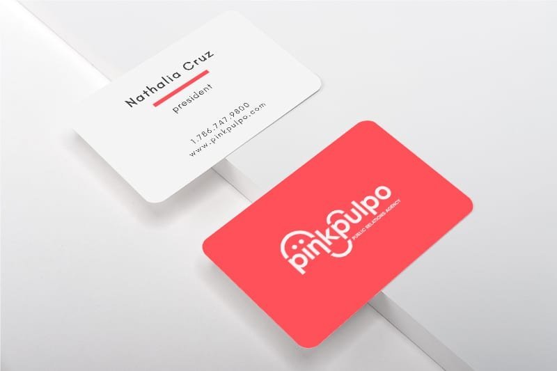
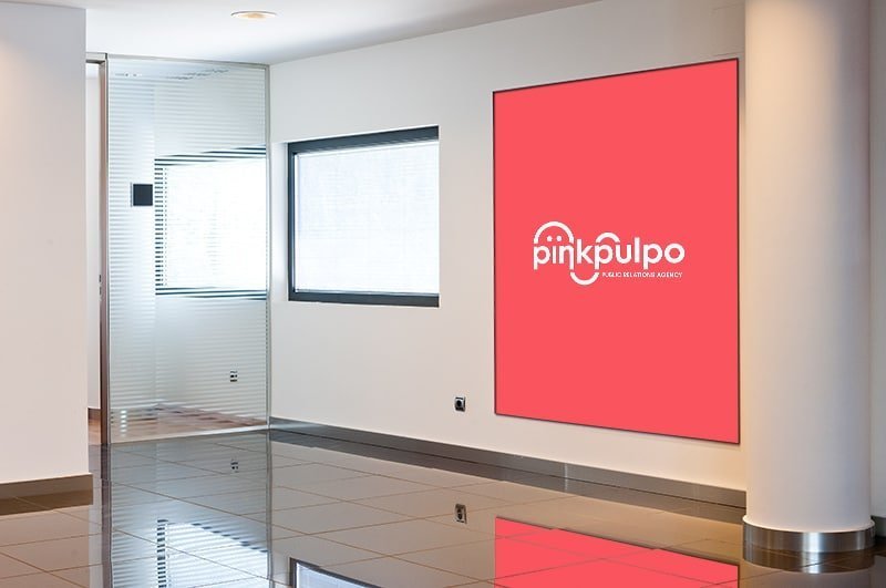
One-color logos are capable of changing their color without losing the essence.
It promotes name recognition and is associated with more traditional and formal approaches to branding.
Digital marketing agency created by experienced technology gurus obsessed with creativity; creativity makes us happy. Call us; we can help your business thrive.
© 2023 Hycrons Tech-Marketing Firm.
All Rights Reserved.