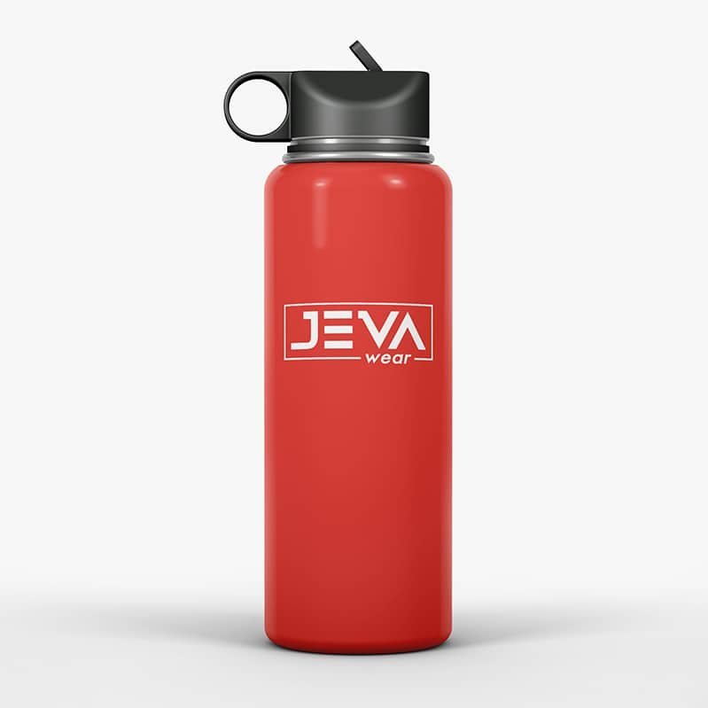
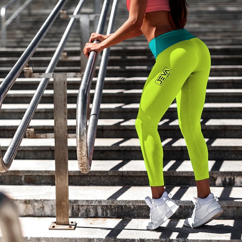
Let’s start by explaining what “Jeva” means. “Jeva” is Spanish slang for a very hot/sexy female. When the CEO approached us, she wasn’t sure what she needed, but she wanted to re-brand. Before we created her logo, she used “JW” as her representation, which didn’t say the essential part of her name: “Jeva.” Therefore, we took the liberty of using “Jeva” and deviating from “JW.” With the client’s brief in mind, we wanted to build a more assertive attitude while creating an easy-to-implement logo. That’s why we chose a monochromatic logo that looked and felt the same, regardless of color.